Primary care managers and leaders from 13 countries have co-developed a toolkit to better support data-driven decision-making in PHC
Lurking on a server somewhere in your primary care system right now is a dashboard. It likely took months to build, contains data with the potential to improve essential healthcare nationwide, and – unless you’re in a minority – you either hate it, only use it when you have to, or don’t even know it exists.
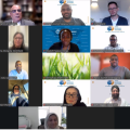
Dashboards have become an invaluable tool in modern health systems across high-, middle- and low-income countries alike. For primary care services in particular they can be especially powerful for frontline clinicians right up to senior decision-makers to understand what is going on across large networks of fragmented clinics. Yet their promise of data-driven decision-making often fails to play out according to a group of 35 national and sub-national PHC managers and leaders across 13 countries, who recently came together as part of the Joint Learning Network on UHC’s Learning Collaborative on PHC Performance Management.
Coming from large and small systems alike, they pointed to a list of barriers that will be familiar to many PHC practitioners who have worked with dashboards before: priority targets buried among dozens of less important indicators; complex logins that makes access a pain; ugly visualizations; and – worst of all – separate dashboards for individual vertical programs that requires flicking between multiple platforms rather than getting a single consolidated view.
With all participants in the collaborative rating improving their dashboard as a ‘high priority’ for their health system, Aceso Global facilitated a peer-learning process, in which participants worked to co-develop a comprehensive PHC Dashboard Redesign Toolkit for taking a dysfunctional or under-used dashboard system and turning it into something that genuinely supports data-driven decision-making. These tools weren’t just developed in the abstract, they were co-created through the simultaneous process of a subset of the countries actively working on dashboard redesigns, through a process called ‘implementation learning’
As such, the toolkit offers an applied ‘by and for practitioners’ resource, using insights from countries that have actually used it. One such country is Mongolia, which had an ambition to upgrade its fairly basic dashboard, which was not widely used among frontline PHCs, with something that would be engaging and intuitive across the primary care system. Throughout the collaborative, their team used many of the co-produced tools to understand what user needs the new dashboard should address, decide how it should be accessed and what it should look like.
The toolkit organizes the redesign journey into three stages. First is preparation, where the toolkit includes a maturity matrix which allows teams to score their existing dashboard across key dimensions; a KPI selection tool to choose which indicators to include; a structured stakeholder needs assessment; and a planning tool for the redesign journey.
The second phase gets into the design and prototyping of the dashboard itself, including guidance on which chart types to use for different purposes; and tips and tricks for combining visualizations into a single dashboard view.
The third phase is implementation, which covers many of the most often overlooked actions that make the difference between a widely adopted dashboard and one that simply collects digital dust. These include a checklist of actions to ensure uptake, and measures to track at varying stages of the rollout.
Of course, no toolkit — however well-designed — can do the hardest part for you: creating the improvement culture, and using data as a catalyst for change. But it can be a good place to start… so long as staff have the skills to interpret the data and put it to good use. That’s where the second workstream of the Learning Collaborative on PHC Performance Management comes in: skills development. Wait for our next blog on building the skills behind better decisions in primary care.
The Dashboard Redesign Toolkit is available online on the Collaborative’s page on the Joint Learning Network for Universal Health Coverage website, where you can also watch a video of the participants talking you through the major elements of the toolkit.